Earlier this week, I attended Ritholtz’s Big Picture Conference. Its my favorite event every year because the quality of the speakers is high, the audience is smart but Barry doesnt take it all too seriously.
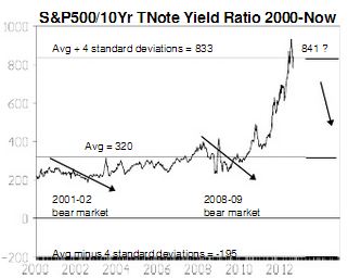
Among the speakers, Michael Belkin, hipsterquantgenius & author of the Belkin Report, dropped this chart on page 41 of the 42 page doc he prepared to accompany his presentation. Take a good look:
Belkin writes,
One inter-market relationship we follow is the ratio of the S&P500 to the 10Yr TNote yield. This obscure ratio shows therelationship between stock prices and interest rates. The ratio can rise when interest rates are falling, to a certain point -which we label the breaking point. The widely-accepted notion that lower rates are positive for stock prices holds true untilthe S&P500/10Yr yield ratio reaches a major extreme – as it did in Mar 2008, April 2000 or July 1990. Bull markets (orbubbles) depend on this ratio expanding. When it reaches an extreme level (as in 2008, 2000 or 1990) and stops rising, amajor stock index decline can occur. In other words: There is a limit to a lower-interest rate boost for stock prices.
I’ve permalinked p. 41 of the report and I think you’ll want to click on over to read the rest of this portion of his packet.
$SPX $SPY


